Question

How to Achieve Classic UI Grid Coloring in Modern UI for a Smart Panel?

  • August 26, 2026
  • 2 replies
  • 86 views

Forum|alt.badge.img+3

Hello Team,

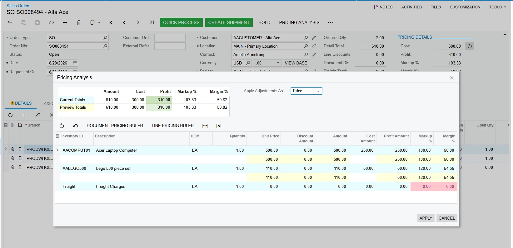
We are using the PXPricingAnalysis package, which includes a Pricing Analysis smart panel popup action. When the popup is opened in the Classic UI, the grid applies specific row and cell colors based on the data.

Currently, this coloring is handled in the graph using the `Page_Load` event. The implementation creates CSS styles using `PXStyle` and applies them to the `PXGrid` rows/cells through `RowDataBound`.

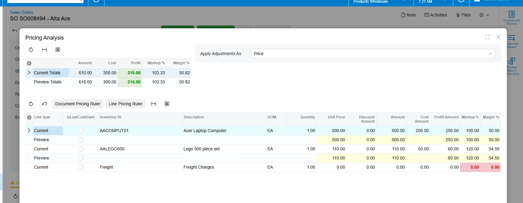
Could anyone please guide us on the recommended way to implement this same row-level and cell-level coloring in Modern UI for this smart panel/grid?

I have included the relevant Classic UI implementation below for reference.

https://github.com/Acumatica/Acumatica-PricingAnalysis


Thank you!

2 replies

Forum|alt.badge.img

Hii ​@Josephf28 ,The TypeScript Implementation 

Replace YourSmartPanelView with your panel's view name, and YourConditionField with your actual field name.

import { CustomEventType, RowCssHandlerArgs, handleEvent } from '@acumatica/qcore';

export class YourScreenGraphName {

// Triggers automatically for every row rendered inside the smart panel grid
@handleEvent(CustomEventType.GetRowCss, { view: 'YourSmartPanelView' })
getPanelRowCss(args: RowCssHandlerArgs): string | undefined {
const row = args.row;

// Condition for coloring (e.g., Hold status, Overdue date, or Custom boolean)
if (row?.YourConditionField?.value === true || row?.YourConditionField?.value === 'Hold') {
return 'classic-alert-row';
}

return undefined;
}
}
  1. The CSS Implementation:This mimics the classic UI style by applying a soft background alert color while ensuring text remains highly legible.
    /* Sets background and hover transparency to match modern grid behavior */
    .classic-alert-row {
    --qp-highlight-color: rgba(231, 76, 60, 0.15) !important; /* Soft red tint */
    --qp-highlight-hover-color: rgba(231, 76, 60, 0.25) !important; /* Slightly darker on hover */
    }

    /* Forces style rules onto individual cell boundaries */
    .classic-alert-row > td {
    background-color: rgba(231, 76, 60, 0.15) !important;
    color: #c0392b !important; /* Sharp classic alert text color */
    font-weight: 500 !important;
    }

    3.Key Deployment Steps:

  2. File Binding: Ensure both files share the exact same name as your screen (e.g., SO301000.ts and SO301000.css).
  3. Customization Project: Upload both scripts via the Modern UI Files section inside your Acumatica Customization Project.
  4. Publish: Run a full compilation/publish of the project extension to register the layout event handles.

Forum|alt.badge.img+3
  • Author
  • Captain II
  • August 29, 2026

Below is the working TypeScript event handling code and CSS layout used to apply dynamic row and cell coloring in Sales Order:

import {
handleEvent,
RowCssHandlerArgs,
CellCssHandlerArgs,
CustomEventType
} from "client-controls";

import { SO301000 } from "src/screens/SO/SO301000/SO301000";

export interface SO301000_PXSOOrderHeaderExt extends SO301000 { }

export class SO301000_PXSOOrderHeaderExt {

private static getRowData(args: any) {
return args?.row ?? args?.selector?.row;
}

// Row-level CSS styling handler
@handleEvent(CustomEventType.GetRowCss, { view: "PricingAnalysisPreview" })
getPricingAnalysisRowCss(args: RowCssHandlerArgs) {
const row = SO301000_PXSOOrderHeaderExt.getRowData(args);
if (!row) return undefined;

const isCurrent = row.LineType?.value === "C";
return isCurrent ? "CssCurentRowStyle" : "CssCurentRowStyleEditing";
}

// Cell-level CSS styling handler
@handleEvent(CustomEventType.GetCellCss, { view: "PricingAnalysisPreview", column: "MarginPercent" })
getPricingMarginCss(args: CellCssHandlerArgs) {
const row = SO301000_PXSOOrderHeaderExt.getRowData(args);
if (!row) return undefined;

const val = Number(row.MarginPercent?.value ?? 0);
return val <= 0 ? "bad" : "CssCurentCellStyleEditing";
}
}
/* --- Summary Header Text Formatting --- */
qp-grid-cell.green20,
.green20,
.green20 * {
color: #008000 !important;
font-weight: bold !important;
}

qp-grid-cell.red20,
.red20,
.red20 * {
color: #c02020 !important;
font-weight: bold !important;
}

/* --- Main Grid: Light Blue Background for 'Current' Rows --- */
qp-grid-row.CssCurentRowStyle,
.CssCurentRowStyle {
--qp-highlight-color: rgb(232, 252, 255) !important;
background-color: rgb(232, 252, 255) !important;
}

qp-grid-row.CssCurentRowStyle qp-grid-cell {
background-color: rgb(232, 252, 255) !important;
}

/* --- Main Grid: Yellow Editable Cells (Preview Rows) --- */
qp-grid-cell.CssCurentCellStyleEditing,
.CssCurentCellStyleEditing {
--qp-cell-background: rgb(255, 255, 220) !important;
background-color: rgb(255, 255, 220) !important;
}

qp-grid-cell.CssCurentCellStyleEditing * {
background-color: rgb(255, 255, 220) !important;
}

/* --- Main Grid: Last Cost Highlight (Orange/Brown Cell) --- */
qp-grid-cell.CssCurentCellStyleLastCost,
.CssCurentCellStyleLastCost {
--qp-cell-background: rgb(255, 217, 179) !important;
background-color: rgb(255, 217, 179) !important;
}

qp-grid-cell.CssCurentCellStyleLastCost * {
background-color: rgb(255, 217, 179) !important;
}

/* --- Main Grid: Zero Margin / Bad Rate Red Alert --- */
qp-grid-cell.bad,
.bad,
.bad * {
color: #c02020 !important;
font-weight: bold !important;
}

qp-grid-cell.bad {
--qp-cell-background: #ffe6e6 !important;
background-color: #ffe6e6 !important;
}
<template>
<require from="./SO301000_PricingSalesOrderExt.css"></require>

<!-- Anchors panel to the main Sales Order form context -->
<qp-panel id="PricingAnalysisPreviewHeaderFilter" after="main-form" caption="Pricing Analysis" auto-repaint="true" width="lg" height="85vh">
<qp-grid id="grdProfitPreview" view.bind="PricingAnalysisPreview"></qp-grid>
</qp-panel>
</template>