
Question

Making a report look like a pivot table

  • August 7, 2026
  • 3 replies
  • 27 views

Forum|alt.badge.img

Hello,


My boss is asking for an automated email of our inventory report every week. Currently we use a pivot table set up by our VAR to show our inventory at a quick glance.



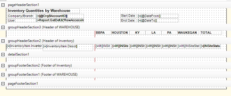
however, i cannot automate this as an excel file email so i have to build a report. I’ve got all the data to show, however, each warehouse creates it’s own line. 

I’ve tried grouping, but that will only pull results for the BBPA location. I looked at possible solutions but adding =Sum to each line didnt work, grouping didn’t work, trying to hide the 0s in the conditions didnt work. 


Any ideas on how to combine all of those lines into one single inventory line like the pivot table does?

3 replies

smilner3
Varsity I
Forum|alt.badge.img+1
  • Varsity I
  • August 7, 2026

You're closer than you think — the data's right, the report just isn't tabular yet.

Report Designer has a built-in mode for exactly this. It's not a control you drag on; it's a set of properties on the report itself, and it turns group instances into columns automatically. No conditional sums, no hiding zeros.

Four properties:

  • Data > Groups — you need two groups. The topmost one becomes your columns, so that's the warehouse. The second is Inventory ID, which gives you one row per item.
  • Behavior > TabularReport = True
  • Behavior > TabularFreeze = a pixel value (the stock example uses 150px). This draws a red vertical line through the group sections. Everything that should repeat as a column goes to the right of that line — a new column is generated per group instance, so your six warehouses become six columns.
  • Layout > Width — width as if the report had only two columns. Width minus TabularFreeze = the width of each warehouse column.

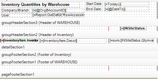
Put your quantity text box in the second group's header, to the right of the red line. The stock example uses =Sum(isnull([SOLine.OrderQty]*-[SOLine.InvtMult],0)) — yours will be your qty field, but the placement is the part that matters. That's why =Sum on each line didn't work: in the detail section it still renders once per record. The grouping plus the tabular properties are what collapse it.

There's a worked activity in the Report Designer guide (Developing Tabular Reports) that builds items × customers. Same shape as items × warehouses.

For the weekly email — that's built in too, and you don't need anything custom:

  • On the report form, Mailing & Printing tab → Mailing section → Format. Options are HTML, PDF, or Excel. That's your Excel file.
  • Email Notifications tab → Schedule Report → opens Email Templates (SM204003) → set recipients → Send By Schedules tab → Create Schedule → Automation Schedules (SM205020) → Weekly, tick the day, set the time.

One gotcha since you want both tabular and Excel: Layout > Excel Mode = Manual is not supported on tabular reports. The system generates the columns itself and ignores manual column settings. Leave it on Auto.


Forum|alt.badge.img
  • Author
  • Jr Varsity III
  • August 7, 2026

You're closer than you think — the data's right, the report just isn't tabular yet.

Report Designer has a built-in mode for exactly this. It's not a control you drag on; it's a set of properties on the report itself, and it turns group instances into columns automatically. No conditional sums, no hiding zeros.

Four properties:

  • Data > Groups — you need two groups. The topmost one becomes your columns, so that's the warehouse. The second is Inventory ID, which gives you one row per item.
  • Behavior > TabularReport = True
  • Behavior > TabularFreeze = a pixel value (the stock example uses 150px). This draws a red vertical line through the group sections. Everything that should repeat as a column goes to the right of that line — a new column is generated per group instance, so your six warehouses become six columns.
  • Layout > Width — width as if the report had only two columns. Width minus TabularFreeze = the width of each warehouse column.

Put your quantity text box in the second group's header, to the right of the red line. The stock example uses =Sum(isnull([SOLine.OrderQty]*-[SOLine.InvtMult],0)) — yours will be your qty field, but the placement is the part that matters. That's why =Sum on each line didn't work: in the detail section it still renders once per record. The grouping plus the tabular properties are what collapse it.

There's a worked activity in the Report Designer guide (Developing Tabular Reports) that builds items × customers. Same shape as items × warehouses.

For the weekly email — that's built in too, and you don't need anything custom:

  • On the report form, Mailing & Printing tab → Mailing section → Format. Options are HTML, PDF, or Excel. That's your Excel file.
  • Email Notifications tab → Schedule Report → opens Email Templates (SM204003) → set recipients → Send By Schedules tab → Create Schedule → Automation Schedules (SM205020) → Weekly, tick the day, set the time.

One gotcha since you want both tabular and Excel: Layout > Excel Mode = Manual is not supported on tabular reports. The system generates the columns itself and ignores manual column settings. Leave it on Auto.

ARLIGHT! This is so confusing. I finally got this figured out some what.. came across a new problem


The warehouses are repeating. With each repetition it’s calculating what’s int he ware house. Do you see how the pattern is happening? Now sure how to stop this. See below. 


think it might be the width - page break math. 


Forum|alt.badge.img
  • Author
  • Jr Varsity III
  • August 7, 2026

update: i got the columns to stop repeating by removing my if warehouse = x then show qty statements.


now my report is blank🤣