Solved

Does Acumatica support a combo chart in dashboard widgets — stacked columns for Qty by item, plus a line for Sales on a secondary axis?

  • September 23, 2026
  • 1 reply
  • 21 views

Forum|alt.badge.img+6

Hello Experts,

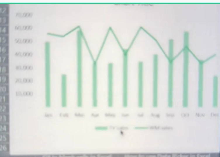
Do you  know whether Acumatica dashboards support the following combo chart​ in a single widget? Looks like belwo chart on the pic.

  • X axis: month
  • Columns: Quantity, stacked (or clustered) by item, showing each item's Qty separately
  • Line: Sales amount, on a secondary Y axis​ (Sales and Qty are on very different scales)

If not natively supported, please advise on the recommended alternative.

Thank you.


Best answer by Steve Milner

@ray20 Not in a single widget, at least through 2026 R1. A chart widget takes one Chart Type, one Categories field, one Series field, and one Value field with one aggregation. There's no combo type and no secondary axis.

The column half works on its own. Use Stacked Column with Categories on your date field (Date Rounding: Months), Series on Inventory ID, and Value on Qty with Sum. Maximum Number of Values Shown defaults to 10 and keeps the largest, so set it to 12 in Categories or your two lowest months drop off. On Series, raise it or tick Show Sum of Other Entries so the small items roll into one block.

For the Sales line, pick one:

- Two widgets are fine: add a Line chart on the same GI with the same Categories settings, no Series, and your sales amount with Sum as the Value. Place it under the column chart. Each widget gets its own axis, so the scale gap stops mattering.
- It must be one visual: build it in Power BI. Its Line and stacked column chart puts the line on a secondary Y axis. Feed it from the same GI through OData, pin the visual to a Power BI dashboard, and show it in Acumatica with a Power BI Tile widget. That needs Power BI and a one-time registration of your instance.


1 reply

Steve Milner
Varsity III
Forum|alt.badge.img+4
  • Varsity III
  • Answer
  • September 23, 2026

@ray20 Not in a single widget, at least through 2026 R1. A chart widget takes one Chart Type, one Categories field, one Series field, and one Value field with one aggregation. There's no combo type and no secondary axis.

The column half works on its own. Use Stacked Column with Categories on your date field (Date Rounding: Months), Series on Inventory ID, and Value on Qty with Sum. Maximum Number of Values Shown defaults to 10 and keeps the largest, so set it to 12 in Categories or your two lowest months drop off. On Series, raise it or tick Show Sum of Other Entries so the small items roll into one block.

For the Sales line, pick one:

- Two widgets are fine: add a Line chart on the same GI with the same Categories settings, no Series, and your sales amount with Sum as the Value. Place it under the column chart. Each widget gets its own axis, so the scale gap stops mattering.
- It must be one visual: build it in Power BI. Its Line and stacked column chart puts the line on a secondary Y axis. Feed it from the same GI through OData, pin the visual to a Power BI dashboard, and show it in Acumatica with a Power BI Tile widget. That needs Power BI and a one-time registration of your instance.