
Question

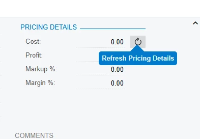
Refresh symbol Pricing Details Action button in Modern UI

  • August 23, 2026
  • 2 replies
  • 31 views

Forum|alt.badge.img

Hi Team

In the Sales Order screen, I have an action button with a refresh Icon and tooltip next to the Cost field in the Classic UI.

How can we Convert this to Modern UI?
 

2 replies

arpine08
Jr Varsity I
Forum|alt.badge.img+2
  • Jr Varsity I
  • August 23, 2026

Hi ​@jason statham,

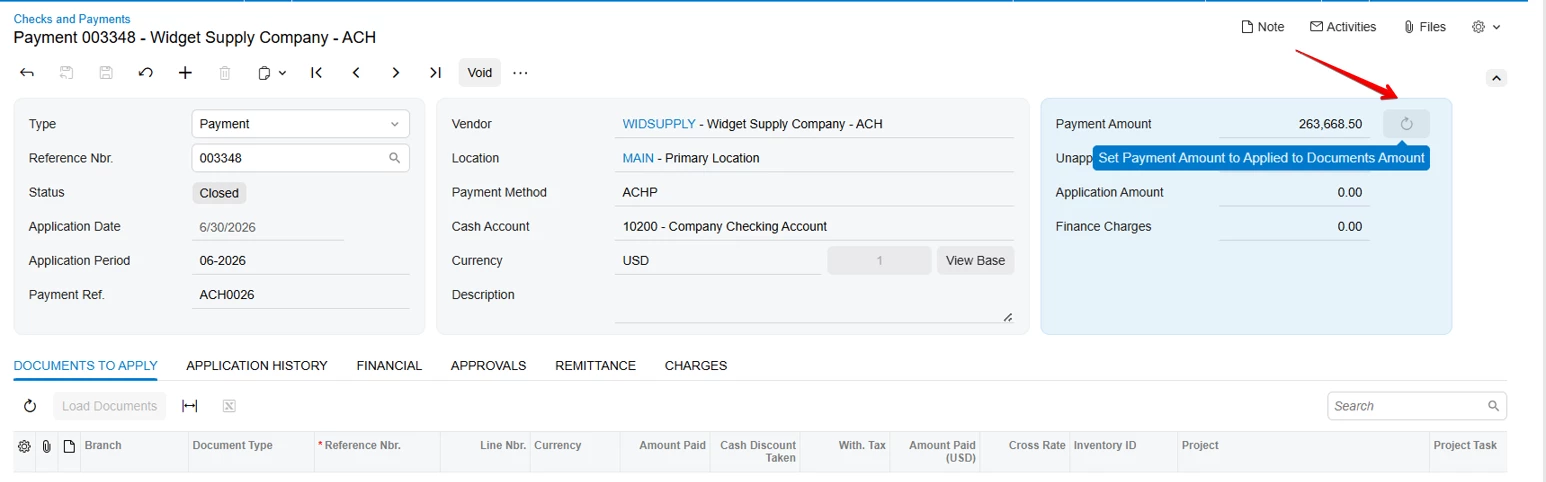
You can use the standard Checks and Payments (AP302000) screen as an example, where a Refresh icon button is used next to the Payment Amount field.

Example from the AP302000 HTML:

<qp-button id="buttonAdjustDocumentAmount"
wg-name="SetPaymentAmounttoAppliedtoDocumentsAmount"
state.bind="Document.AdjustDocAmt"
class="col-2"
config.bind="{imageSet: 'main', imageKey: 'Refresh'}"
pinned>
</qp-button>

The Refresh icon is configured using:

config.bind="{imageSet: 'main', imageKey: 'Refresh'}"

The tooltip can be defined directly on the action in C#:

[PXButton(Tooltip = "Refresh Pricing Details")]

This works in both Modern UI and Classic UI.

Alternatively, the tooltip can also be defined in the HTML using:

tooltip.bind="LocalizableStrings.myTooltip"

Here are also some relevant Acumatica Help articles and a Community discussion:

Button with an Image

Using Localizable Strings Defined in TypeScript in HTML Code

ToolTips on Modern UI


Forum|alt.badge.img+3
  • Captain I
  • August 24, 2026

@jason statham 

To Add a Refresh button behind the your cost field

 @actionConfig({ toolTip: "Refresh Pricing Details", imageSet: "main", imageKey: "Refresh" })
YourActioView: PXActionState;
 <field prepend="#YourFieldSetId field[name='View.YourCostField']">
<qp-button id="btnPricingDetails" state.bind="View.PricingDetails"
config.bind="{ images: { normal: 'svg:main@Refresh' }, displayIconAndText: false }">
</qp-button>
<qp-tooltip target.bind="btnPricingDetails">Refresh Pricing Details</qp-tooltip>
</field>

Hope this works!