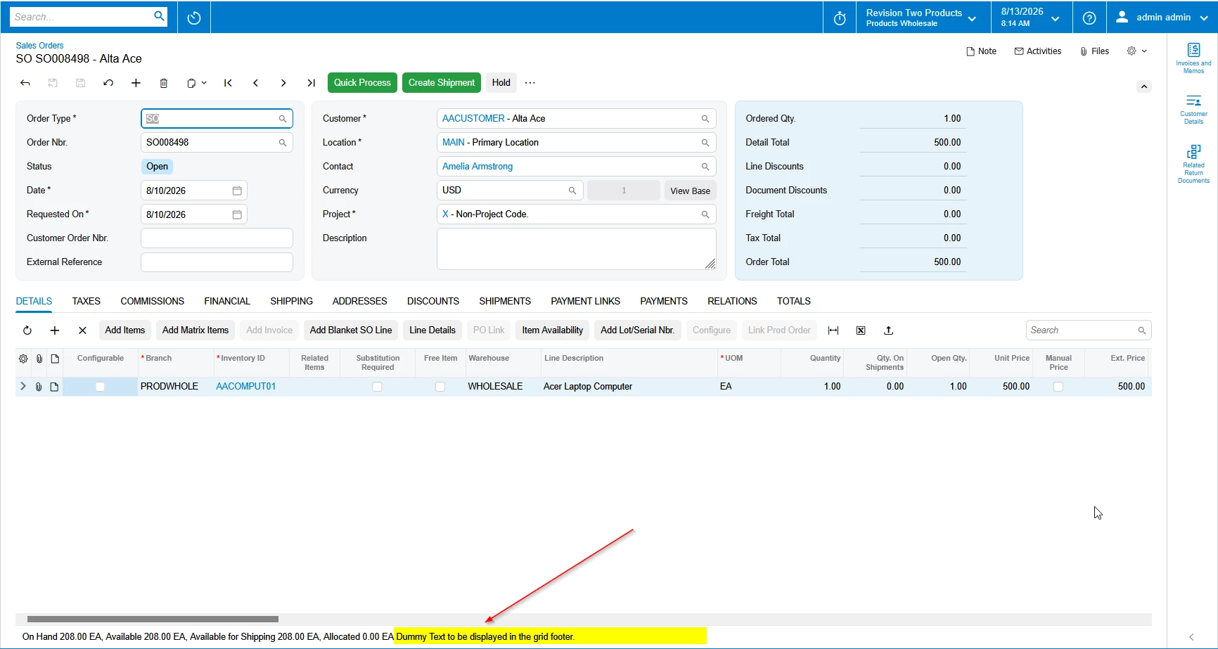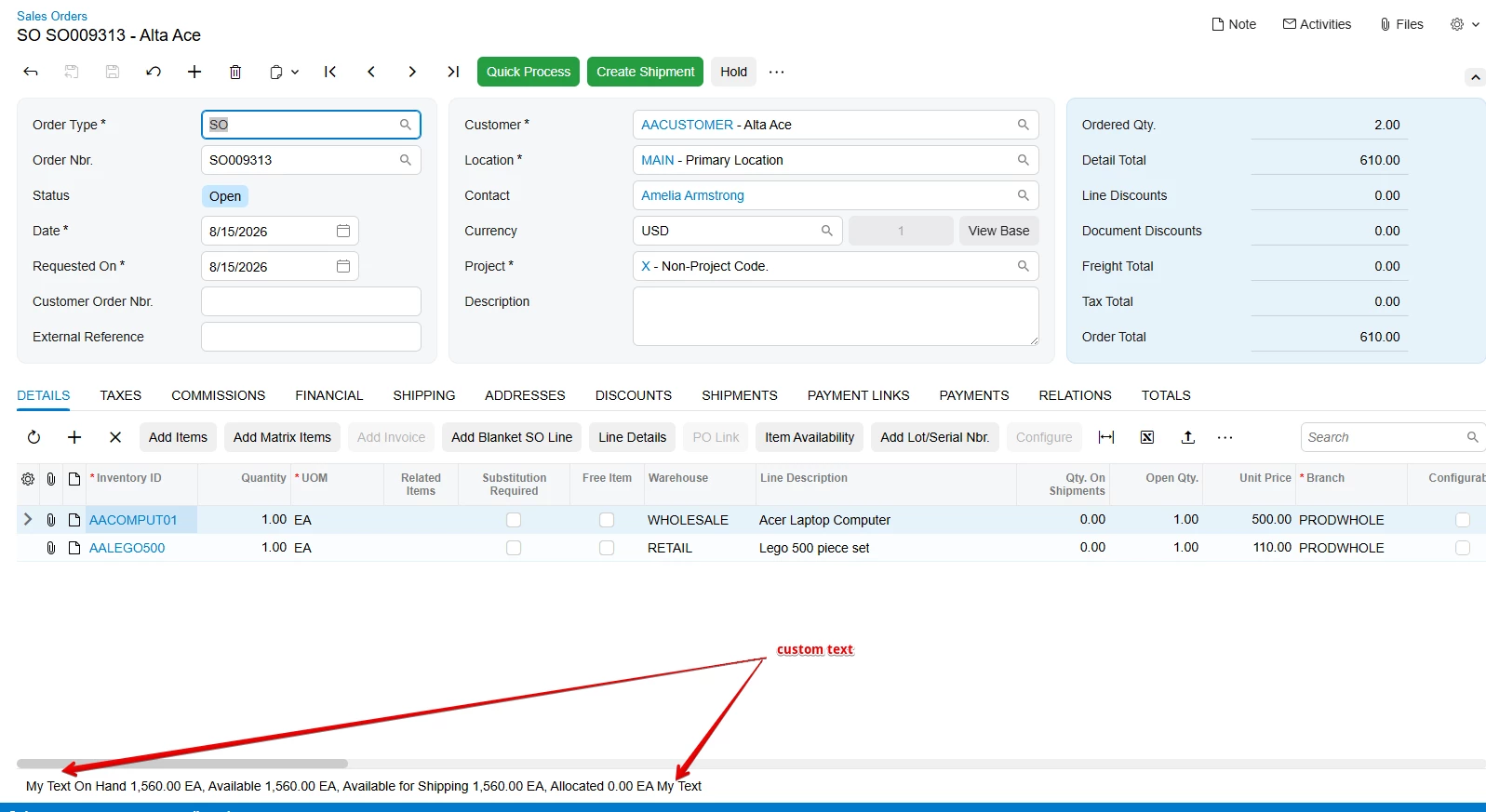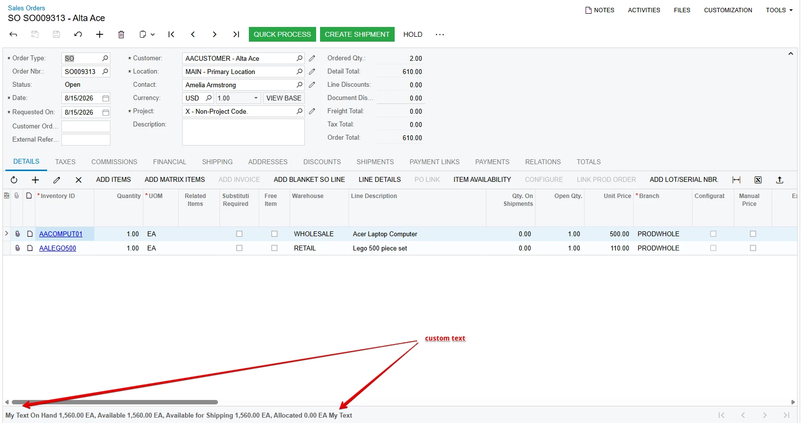




Have you ever needed to display additional information below an Acumatica grid—for example, an availability message, status, instructions, totals, or other contextual information?
There are different approaches depending on whether the screen is using Classic UI or Modern UI.
Classic UI – Using StatusField
In Classic UI, Acumatica's PXGrid supports the StatusField property.
The general approach is:
- Add a
PXStringfield to the DAC used by the grid. - Set the grid's
StatusFieldproperty to that field. - Populate the field using a
FieldSelectingevent.
For example, suppose the grid is based on SOLine and we want to display a custom message.
1. Add a DAC extension field
public sealed class SOLineExt : PXCacheExtension<SOLine>
{
    #region Availability
    [PXString(255)]
    [PXUIField(DisplayName = "Availability")]
    public string UsrAvailability { get; set; }

    public abstract class usrAvailability :
        PX.Data.BQL.BqlString.Field<usrAvailability>
    {
    }
    #endregion
}
2. Populate the value
You can populate the value using FieldSelecting:
protected virtual void _(Events.FieldSelecting<SOLine, SOLineExt.usrAvailability> e)
{
    e.ReturnValue = "Text to be displayed in the grid footer.";
}
3. Set the grid's StatusField
In Classic UI, the grid can reference the field through StatusField:
<px:PXGrid
    ID="grid"
    runat="server"
    DataSourceID="ds"
    StatusField="UsrAvailability">
</px:PXGrid>
The value of UsrAvailability is then displayed in the grid's status/footer area.
The important point is that the field does not necessarily have to represent a database value. It can be a calculated/unbound field whose value is generated dynamically.
This is particularly useful when the message needs to change based on the currently selected grid record.
What About Modern UI?
This is where older examples need to be treated carefully.
The PXGrid/StatusField approach is a Classic UI implementation. Modern UI uses the newer Acumatica UI component architecture, so you should not assume that an old ASPX customization can simply be carried forward unchanged.
For Modern UI, the grid/table component provides a footerText property for displaying information in a column's footer area.
For example, the Modern UI framework supports setting footer text programmatically:
const column = grid.getColumn("SomeField");

if (column) {
    column.footerText = "Text to be displayed in the grid footer.";
}
Acumatica's UI Component Guide also demonstrates using footerText to display calculated values in table/grid footer areas.
This is the preferred direction when implementing a Modern UI-compatible customization rather than relying on the Classic UI StatusField property.
Summary
If you are working with an older Classic UI screen, StatusField remains a useful technique:
StatusField="UsrAvailability"with a corresponding DAC field and FieldSelecting event.
For Modern UI, however, the grid/table component model is different. When the requirement is to display information in a column footer, use the Modern UI footerText capability rather than manipulating the generated HTML.
This distinction becomes increasingly important as customizations are migrated from Classic UI to Modern UI.