Question

Help with column widths - Dashboard Widget

  • 25 March 2024
  • 4 replies
  • 78 views

Hi Acumatica Community,


I am fairly new to dashboarding within Acumatica and in one of my Column Widgets, the column’s are narrow and when hovering over each of the data points the line through is not centered. 


Does anyone know how I am able to adjust the width’s of the column widget? Screenshot below:


Also on the topic of column widgets, does anyone know if it is possible to change the default blue columns?


I’d expect the first column widget to have the same width and the blue one above, also when hovering the line in centered through the column.


Any feedback or suggestions would be greatly appreciated!


Thank you

4 replies

Userlevel 6
Badge +6

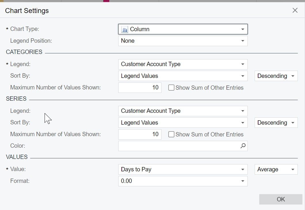
@marshallsears  Please share your widget Chart Settings (Widget Properties >Configure)

Hey @hkabiri, sure thing. Screenshot below of the settings:


Userlevel 6
Badge +6

@marshallsears The way it is designed each section is being divided by number of different values in your case 10 as Legend on Categories and Series are set to same Value: Customer Account Type.

Each of these 10 sub-section has a different color and if you look at the position of column in compare to middle line you can figure it out.

Regarding the color you can define on the Series Color as you can see in my example:


@hkabiri Right on! Thank you for investigating and the explanation, I will test adjusting the chart’s settings and report back. 


I will also test implementing the color string from your screenshot, thank you for that!


Marshall

Reply