
Acumatica BI & Analytics: New Widget types for Dashboard Visualizations

  • April 29, 2025
  • 12 replies
  • 555 views

PrasadIllapani76
Freshman I

Dear Acumatica Community Users,

As part of the Acumatica BI & Analytics solution roadmap, we are looking to expand our Dashboard Visualization capabilities by introducing new widget types. These enhancements aim to support a wide range of analytics use cases across various application areas.

We are considering the addition of the following widget types:

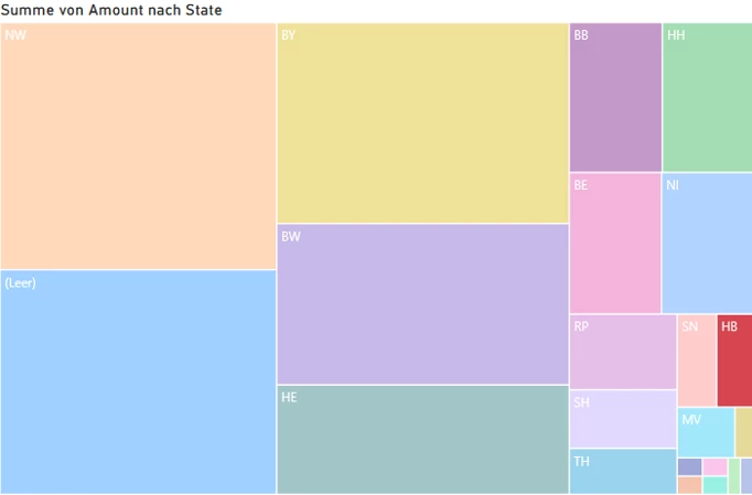
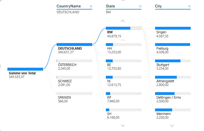
  • Charts: Pie charts, Radar charts, Hierarchy charts, and Stock charts.
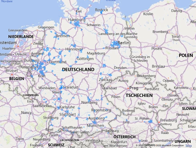
  • Maps: Such as Geographical maps, Tree maps, and Area maps (e.g., Choropleth, Isopleth).
  • Others: Any other types of widgets that can enhance your analytics user experience.

We invite you to share your specific needs for new widget types that would benefit your analytics business use cases. Please provide your suggestions and requirements by sharing your list here. Based on the feedback received from the Acumatica users, we will prioritize the development and delivery of these new widgets in our upcoming releases.

Thank you for your valuable input and continued support.

Prasad Illapani,

Acumatica Platform & Analytics Team

12 replies

Chris Hackett
Community Manager
Forum|alt.badge.img
  • Acumatica Community Manager
  • April 30, 2025

Thank you for reaching out to the community for input ​@PrasadIllapani76!


PeterNicholson
Freshman II
Forum|alt.badge.img

Not that I have any immediate requirements for it, but it’d be amazing to have the ability to upload a custom shape file and use it as a heat map.  The options here could be endless.  You could have a shape file for your factory floor plan, warehouse layout etc.  Then, use a GI as a source to overlay metrics and display as a heat map.

Work centers that are over capacity or have a line-down,  warehouse locations that are below inventory levels, analysis of picking routes.  How about a heat map that displays high pick frequency locations which could help a warehouse manager better improve stock locations to reduce operative time spent walking between locations, etc, etc, etc.


bwhite49
Captain II
Forum|alt.badge.img+10
  • Captain II
  • May 2, 2025

New BI charts would be a welcome addition to Acumatica. Adding more statistical tools like a linear trend line to line charts would be a great feature starting point. We have had several clients asking for a simple trend line.

For general navigation enhancements and changes to existing widgets I would like to see…

  1. The ability to add color hex codes to KPI widgets and charts that do not have a “series.” I want to be able to change the color of any widget to any color I want, and I want the option to define colors based on data values. For example, I might have 2 pie charts that display a different time series. The 2 pie charts show sales data grouped by item class. One pie chart shows the current year and the other shows the previous year. I want to be able to define Item class A as blue and item class B as red and have that display across all charts so that it’s easier to track the same product line across multiple visuals.
  2. I would like to see a button widget that looks like a KPI widget. The link widget is unattractive and easy to miss. The button can link to internal and external links. Why can’t the link widget link to external websites/pages? Can the link change based on parameter or data values?
  3. I would like the option to modify the color and or font features of the header widget. We need a way to better visualize dashboard sections. Maybe we need can have block sections and be able to add widgets to the block.
  4. I would like a widget to add to display an image. Whether it’s a logo or a product image, I want to be able to display it. This widget would use a URL as a data source. Ideally, we could also display images from URLs listed in a GI list. So, if I change the parameter is listed in a dashboard that links to an inventory ID, the image would change based on the inventory ID parameter.
  5. For internal embedded pages, for example the sales order screen, it would be great to just shows the sales order screen and not the website header and the navigation side bar. If possible, this would reduce unnecessary “clutter.”
  6. How about a text block or a html block outside of a wiki page? Making a wiki page isn’t always an easy experience. What if we could just paste in some HTML and have that display?


PrasadIllapani76
Freshman I

Thank you. 

Adding a trend line to the chart widget is planned in the upcoming release. I will add the above widget enhancements list to our dashboard improvements roadmap topic.

Prasad 


Forum|alt.badge.img+1
  • Jr Varsity II
  • May 8, 2025

Simply - multi series charts.

Examples:

  • Report sales and Cost Of Goods on the one chart.
  • Report Actual and Budget on the one chart.
  • etc

RaphaelPfaff12
Semi-Pro III

Hi ​@PrasadIllapani76 

we’ve been gathering various requirements and ideas to enhance our widget functionality. Before diving into new widget types, there are two key requests we’d love to address:

  • Precise Widget Refresh Settings
    For performance-intensive widgets, it would be beneficial to have configurable refresh timings. This would allow users to schedule updates during non-peak hours, ensuring system performance remains unaffected.

  • Comparison Features
    Introducing the ability to compare results across periods, such as year-over-year, quarter-over-quarter, or even custom timeframes. This would provide greater flexibility and deeper insights for analysis.


As for additional widget types in Acumatica, here’s what we envision:

  • Treemap

    A visual representation of data in a hierarchical structure using rectangular areas to represent categories. The size and color of the rectangles would reflect different dimensions or values, making it easier to comprehend complex data at a glance.

  • Analytic Tree

    A hierarchical tree structure that breaks down data into smaller, more digestible segments for systematic analysis. Similar to Power BI, it should support data selection from multiple tables (e.g., State, Customer Class, etc.).


  • Map

    A chart to analyze the distribution of customers, leads, or suppliers. Ideally, this would work without requiring additional setup (e.g., Google Maps or Azure Maps). Instead, location recognition should function based on postal code, city, state, and country, eliminating the need for precise latitude and longitude inputs.


We’re excited about these ideas and look forward to hearing your thoughts and feedback. Let’s make Acumatica even more powerful together!


ketiller
Jr Varsity III
Forum|alt.badge.img
  • Jr Varsity III
  • May 8, 2025

​​​​@PrasadIllapani76,

  1. KPI Widget allow for GI field schema to be brought over, very limiting when trying to show $ values or percentages
  2. Ability to have multiple chart type is one widget, for example have Revenue by period represented in a stacked bar and Forecast for that period represented in a line chart.
  3. Dynamic slicers or filters specific to a widget versus the whole dashboard

Thank you,

Kage


Forum|alt.badge.img
  • Jr Varsity II
  • May 9, 2025

@PrasadIllapani76 

I would like to add some points:

  • We should add a slicer to make filtering the entire dashboard easier—for example, filter by date.
  • The table should provide an option to display totals either by column or by row, making it easier to analyze the data at a glance.
  • For charts, we should add value data labels to display values clearly.

Thank you,

Thira


TimRodman
Pro I
Forum|alt.badge.img+1
  • Pro I
  • May 9, 2025

Adding a Map Widget would be my top request.


Forum|alt.badge.img+1
  • May 12, 2025

Ability to add a list of clickable links (internal and external to the ERP).


This is not data analytics, but definitely needed on various dashboards. Currently, for external links we can either add the link text or use a workarounds like Wikis or using embedded spreadsheets, but it is not scalable.


jfbrut91
Jr Varsity II
Forum|alt.badge.img
  • Jr Varsity II
  • June 12, 2025

An important improvement would be to be able to use hex codes for color formatting in all widgets, including generic inquiries, as it is difficult, if not impossible, to have the same color on a graph, a GI and a KPI. For some customers, this is a real problem, as the color may have a particular meaning in their business.


dgodsill97
Varsity I
Forum|alt.badge.img+3
  • Varsity I
  • June 18, 2025

A spark chart,