
Modern UI Issues

  • June 10, 2026
  • 60 replies
  • 1262 views

Show first post

60 replies

Freeman Helmuth
Semi-Pro I
Forum|alt.badge.img

I think the big one is the removal of tabs on GI filters. This change was not good.

I also struggle with the import scenario builder in modern UI. I have to toggle between the two UIs to find fields, and it takes much longer to build them than they used to. 

There are also quite a few bugs. Here are a couple to start…

  1. Can’t rearrange parameters and conditions in the GI editor anymore.
  2. Export to excel for GIs is still broken
  3. Performance seems to decline on screens/GIs using modern UI


Here’s the related idea and our fix for it. Linking it here for visibility:


Forum|alt.badge.img


Hi there,

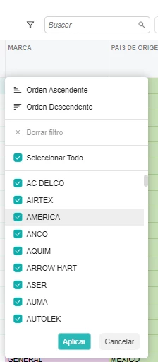
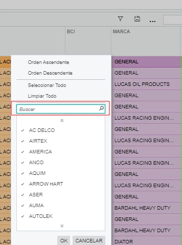
When you wan’t to apply a filter with an attribute column on a generic inquiry, there is no search field anymore at the top of the list.

Modern UI:

Classic UI: 


Forum|alt.badge.img

Hi,

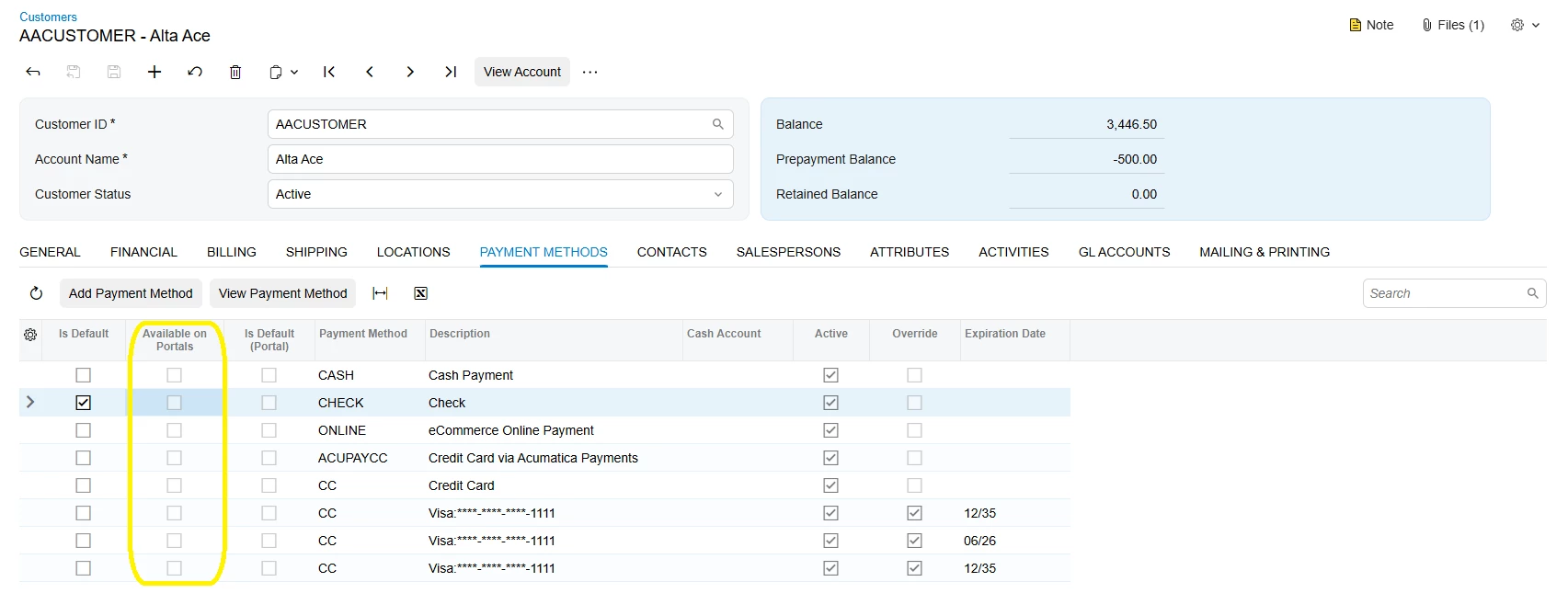
We have noticed that the 'Available on Portals' field in the Payment Method tab cannot be enabled/saved in versions 25R2 and 26R1.


Pop Up Note Functionality - Worse in Modern UI

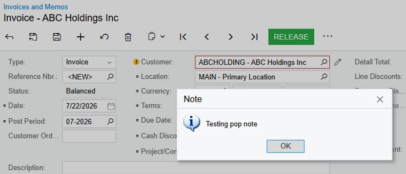
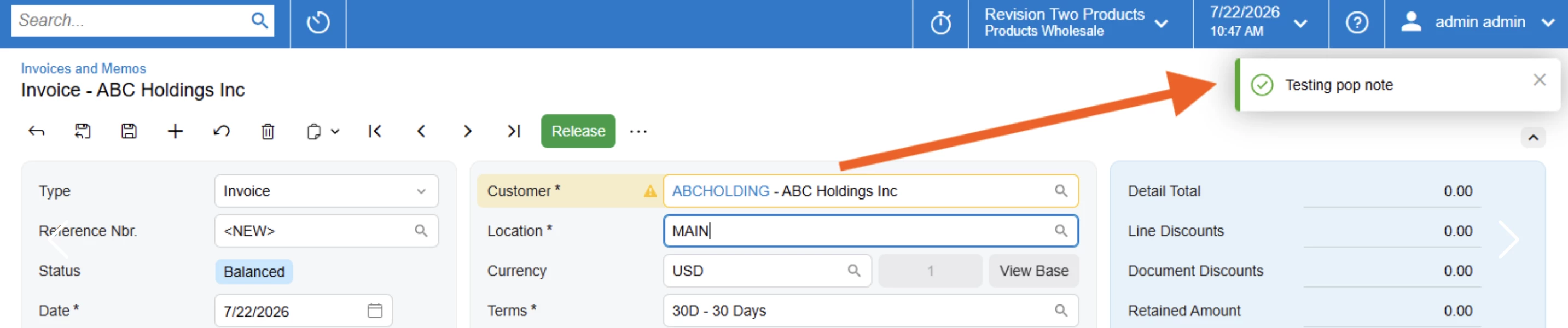
Pop up notes in modern UI display as a small, green check box in the top right of the screen, and disappear on their own. The visibility is very poor, and makes the note incredibly easy to overlook and miss.

Classic:


Modern:


darylbowman
Captain II
Forum|alt.badge.img+17

Pop up notes in modern UI display as a small, green check box in the top right of the screen, and disappear on their own. The visibility is very poor, and makes the note incredibly easy to overlook and miss.

This is significantly improved in 26 R1. They display as a blue info box and don’t disappear.


sgaspar72
Jr Varsity III
Forum|alt.badge.img+1
  • Jr Varsity III
  • July 22, 2026

Wouldn't even know where to start on this thread. We’ve just moved all companies back to the classic UI except for a couple of dashboard screens. Most of our ISV partners have had to do the same with their packages.

Now we just get a daily stream of requests as to when the modern UI will be useable. We don’t have an answer to provide. So we’re just waiting. 


Pop up notes in modern UI display as a small, green check box in the top right of the screen, and disappear on their own. The visibility is very poor, and makes the note incredibly easy to overlook and miss.

This is significantly improved in 26 R1. They display as a blue info box and don’t disappear.

Oh, that’s great to know, thank you!!


Freeman Helmuth
Semi-Pro I
Forum|alt.badge.img

Build 26.100.0175:

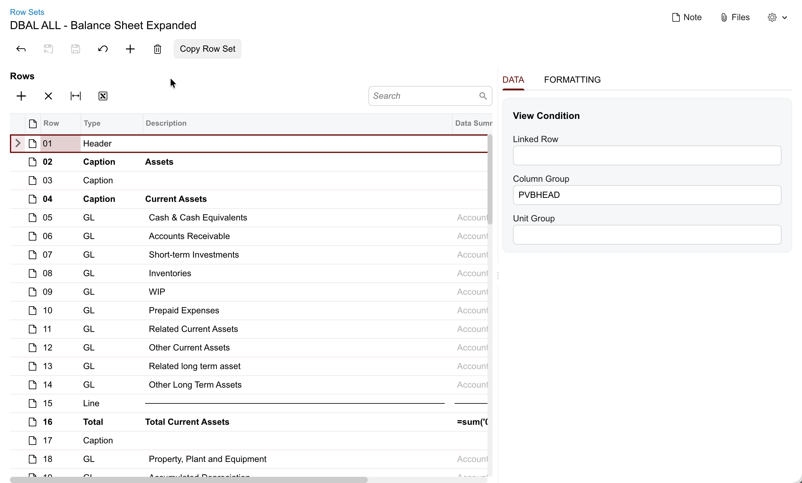
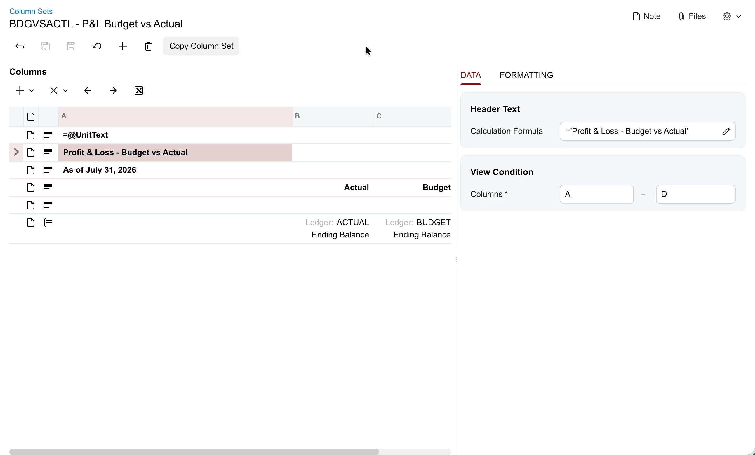
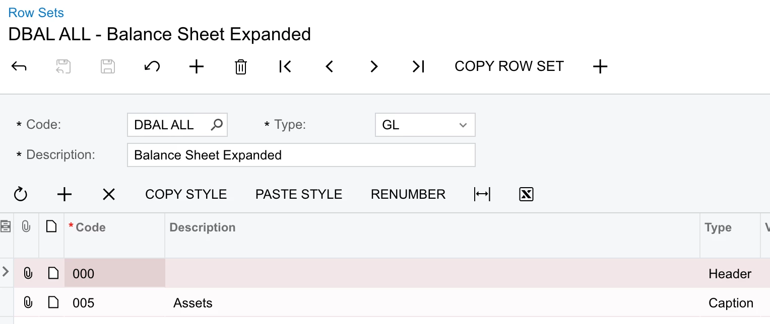
The modern UI version of the row sets and column sets screens do not allow the user to change description of the row set or to select a different row set without going back to the list screen. The selector and description box is missing:

Classic UI:


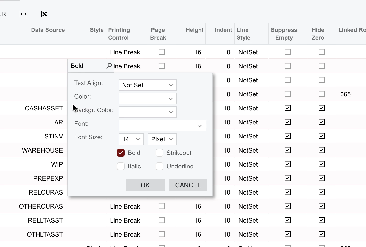
Because the rows no longer include any formatting details, it also takes much longer on the modern UI version of these screens to compare formatting of rows and ensure that it’s correct:
 

Classic UI: I can see quite a few details of the formatting at a glance:


Freeman Helmuth
Semi-Pro I
Forum|alt.badge.img

Build: 26.100.0175

When navigating to a modern UI report, the URL stays the same as the prior screen’s URL:

Prior Screen:


After navigating to the report: The screen ID is the same-only the parameter changes which causes the report to load:

So if you then refresh the page you are taken back to the prior screen.

This does not happen in the Classic UI. The screen ID properly changes to the RMxxxxxx ID


Freeman Helmuth
Semi-Pro I
Forum|alt.badge.img

Build 26.100.0175

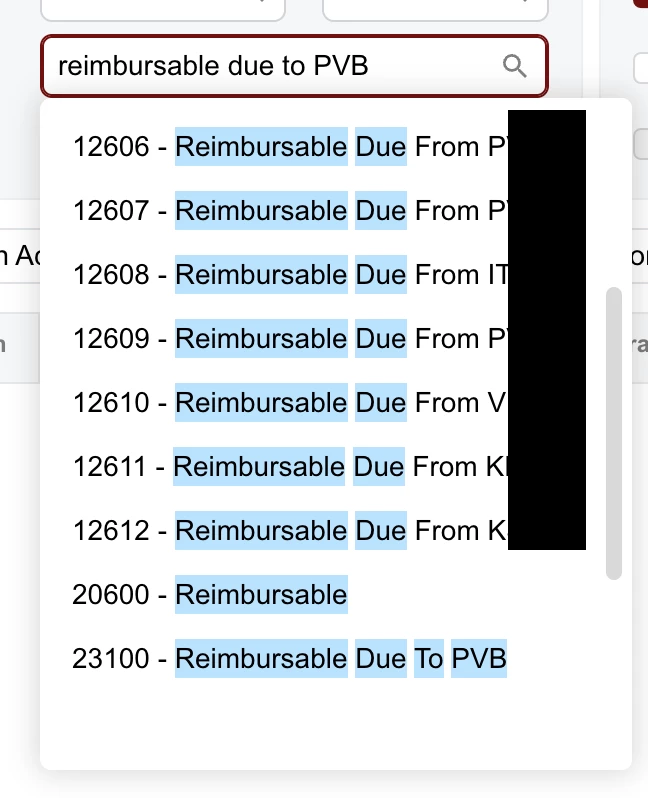
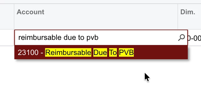
Another UX issue: When typing the value of a item into a selector, the Modern UI selector has far poorer search logic than the Classic UI selector. This behavior is present in all selectors in the modern UI.

In this example the exact text match is the last result in the list:

Classic UI filters to the exact match instantly: