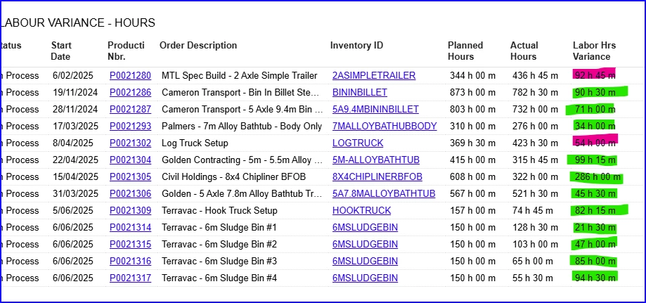
On our dashboard, we have data that shows production labour vs planned labour and a variance number - however, the number comes out as an absolute number.
To solve this, i was wondering if anyone has created a colour coding for a column for those that are over planned and those that are under planned - on the dashboard table.?