I have a dashboard that was created and it works. However, it almost runs together. Does anyone know of a way to color code the charts on dashboards?
 +18
+18I have a dashboard that was created and it works. However, it almost runs together. Does anyone know of a way to color code the charts on dashboards?
Best answer by KurtBauer
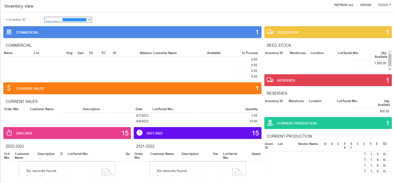
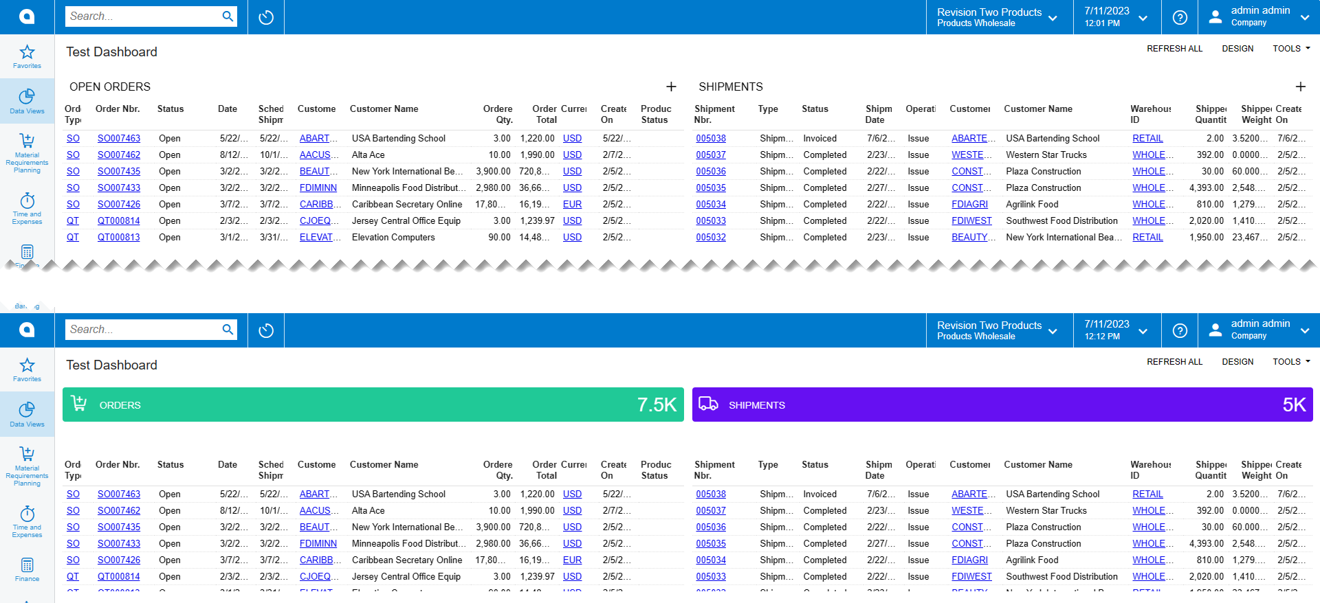
It’s not perfect, but you use a blank title for the data table and then add a scorecard KPI widget above where you count the total records in the table below and force in the color. Below is a quick before and after I mocked up in demo data.
No account yet? Create an account
Enter your E-mail address. We'll send you an e-mail with instructions to reset your password.