Solved

dashboard - year over year sales

  • 16 February 2023
  • 2 replies
  • 356 views

I am trying to create a GI to show this years sales data compared to LY sales. Any ideas how to get started with this? I have pulled the data since @yearstart and for where docdate >= @yearstart-1 and docdate<= @yearstart-1. How can I show those on the same line graph?


2 replies

Userlevel 7
Badge +9

Whatever you want to show on axises will need to be in one column. So in your case you will need 2 columns in your result grid (of course you can have more columns but for sake of DB I mean). One column is going to be Year and another one Amount or Quantity. The qry or amt is straight forward. For the year column you will need to use a formula that extracts the fiscal year based on a fixed value comparison or a cutoff month parameter. Possibly the easiest way is to get the left 4 digit of TranPeriod or FinPeriod. Something like =Left(DAC.TranPeriodID, 4) or get year from DocDate something like =Year(DAC.DocDate)

In DB then you will use this formulated column let say you call it Year, as axis and Amount as value and you can have a comparison column chart

Userlevel 7
Badge +3

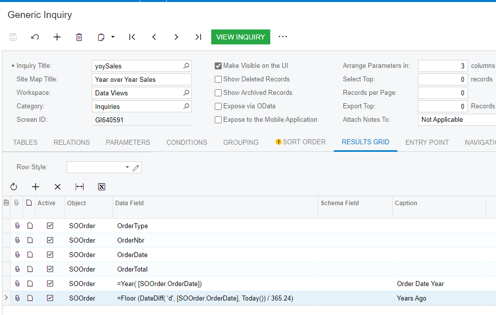
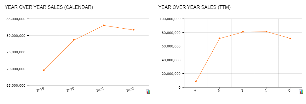
@jsparks62 User @aaghaei described the solution. I had to do something like this a while ago using Sales Orders so I thought I would share some screen shots.
 

Inquiry Results Grid (last line is if you want trailing twelve months)

Resulting Dashboards

Data Conditions select Order Dates between @YearStart-4 and @YearStart (favors Calendar) select Order Dates between =DateAdd(Today(), ‘y’, -4) and Today() if you are using Trailing 12 Months 


Reply