Solved

ToolTips on Modern UI

  • January 5, 2026
  • 3 replies
  • 145 views

 Hello,

Has anybody figured out how to display the tooltip on a field? I am trying to follow the options here without much success: https://help.acumatica.com/(W(11))/Help?ScreenId=ShowWiki&pageid=b510e5fb-72c3-42f5-a48c-39dda10f0acc


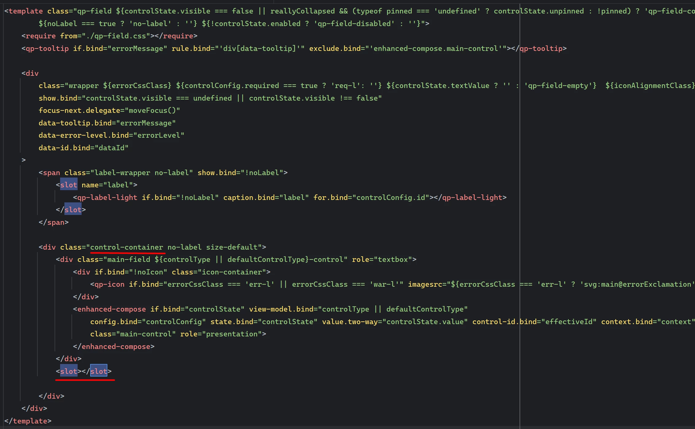
How it was displayed on the classic UI (ASPX):

<px:PXDropDown runat="server" ID="edUsrTBBRPDValidationBrand" DataField="UsrTBBRPDValidationBrand" ToolTip="Controls validation behavior when Brand is missing or invalid during XYZ Product Data processing. Options: None (no validation), Warn (display warning), Error (block processing)." />


Here is what I’ve tried:

.ts File:

import { Messages as SysMessages } from "client-controls/services/messages";
import { createCollection, createSingle, PXScreen, graphInfo, PXActionState, viewInfo, handleEvent, CustomEventType, actionConfig, RowSelectedHandlerArgs, PXViewCollection, PXPageLoadBehavior, ControlParameter, localizable } from "client-controls";
import { INSetup } from "./views";

@localizable

class LocalizableStrings {
    static UsrTBBRPDValidationBrand = "Controls validation behavior when Brand is missing or invalid during XYZ Product Data processing. Options: None (no validation), Warn (display warning), Error (block processing).";
}


@graphInfo({graphType: "TBBlueRidge.TBBRSetup", primaryView: "BlueRidgeSetup", })

export class TBBR1000 extends PXScreen {

    BlueRidgeSetup = createSingle(INSetup);
    LocalizableStrings = LocalizableStrings;

}

HTML file:

				<qp-fieldset id="fsProductValidations" view.bind="BlueRidgeSetup" caption="Product Validations">
<field name="UsrTBBRPDValidationBrand" tooltip.bind="FieldToolTips.UsrTBBRPDValidationBrand"></field>
</qp-fieldset>


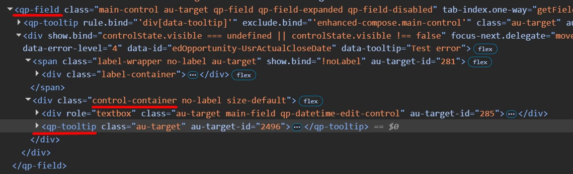
I’ve also tried this in the views.ts:

import { PXView, PXFieldState, gridConfig, treeConfig, fieldConfig, controlConfig, actionConfig, headerDescription, ICurrencyInfo, disabled, PXFieldOptions, linkCommand, columnConfig, GridColumnShowHideMode, GridColumnType, PXActionState, TextAlign, GridPreset, GridFilterBarVisibility, GridFastFilterVisibility, ISelectorControlConfig, ControlParameter } from "client-controls";
import { TBBR1000 } from "./TBBR1000";

import {
localizable
} from "client-controls";

@localizable
class TestToolTips {
static ValidationBrand = "Test123";
}
// Views

export class INSetup extends PXView {

@controlConfig({
tooltip: localizable(TestToolTips.ValidationBrand)
})
UsrTBBRPDValidationBrand : PXFieldState;


}


I’ve not had any success in getting the message to display when hovering over the field drop-down nor title. Any help would be greatly appreciated.

Best answer by aleksandrsechin

Hi ​@Brandon379 
I spent enough time looking for ways to define tooltips for fields, and here is what I found:

1. For a grid field, you can define a tooltip in the .ts file, as shown in the code snippet below. The tooltip is displayed when you hover over the column title:

@gridConfig({
preset: GridPreset.Details
})
export class MySetup extends PXView {
@columnConfig({ toolTip: LocalizableStrings.myField_tooltip })
MyField : PXFieldState;
}

@localizable
export class LocalizableStrings {
static myField_tooltip = "My tooltip text.";
}


2. For a field defined in a fieldset, I wasn’t able to find an approach that works (neither in .ts nor in .html). However, tooltips do work for buttons, and based on this, I found the following workaround:

The idea is to define a disabled button with the caption i that contains the tooltip. Below is a code example: 

<field name="MyField">
<qp-button caption="i" enabled.bind="false" class="col-auto"
tooltip.bind='LocalizableStrings.myField_tooltip'>
</qp-button>
</field>
@localizable
export class LocalizableStrings {
static myField_tooltip = "My tooltip text.";
}

@graphInfo({
graphType: "MyMaint",
primaryView: "Setup"
})
export class AA101000 extends PXScreen {
...
LocalizableStrings = LocalizableStrings;
...
}

Hope this helps.

3 replies

Marco Villasenor
Jr Varsity II
Forum|alt.badge.img+3

I think you are missing referencing the correct class for your localized message in the HTML: “LocalizableStrings”

Using your original ts file, try this in the HTML:

<qp-fieldset id="fsProductValidations" view.bind="BlueRidgeSetup" caption="Product Validations">
<field name="UsrTBBRPDValidationBrand" tooltip.bind="LocalizableStrings.UsrTBBRPDValidationBrand"></field>
</qp-fieldset>


Forum|alt.badge.img+4

Hi ​@Brandon379 
I spent enough time looking for ways to define tooltips for fields, and here is what I found:

1. For a grid field, you can define a tooltip in the .ts file, as shown in the code snippet below. The tooltip is displayed when you hover over the column title:

@gridConfig({
preset: GridPreset.Details
})
export class MySetup extends PXView {
@columnConfig({ toolTip: LocalizableStrings.myField_tooltip })
MyField : PXFieldState;
}

@localizable
export class LocalizableStrings {
static myField_tooltip = "My tooltip text.";
}


2. For a field defined in a fieldset, I wasn’t able to find an approach that works (neither in .ts nor in .html). However, tooltips do work for buttons, and based on this, I found the following workaround:

The idea is to define a disabled button with the caption i that contains the tooltip. Below is a code example: 

<field name="MyField">
<qp-button caption="i" enabled.bind="false" class="col-auto"
tooltip.bind='LocalizableStrings.myField_tooltip'>
</qp-button>
</field>
@localizable
export class LocalizableStrings {
static myField_tooltip = "My tooltip text.";
}

@graphInfo({
graphType: "MyMaint",
primaryView: "Setup"
})
export class AA101000 extends PXScreen {
...
LocalizableStrings = LocalizableStrings;
...
}

Hope this helps.


Hi ​@Brandon379
 

I spent many hours researching the use of tooltips.
I researched Acumatica’s and Aurelia source code to see how they use tooltips in their standard components.

To be honest, I don’t understand why we have tooltips on buttons, or for example, on grid columns, but can’t have tooltips on form fields - that’s strange.

In fact, we already have tooltips on form fields - warnings and errors are displayed in the tooltip, but they only appear while the field is in a warning or error state.

After all my research, I’ve come to the following solution (which, in my opinion, is the best and cleanest solution):

<field name="MyField">
<qp-tooltip>My tooltip text.</qp-tooltip>
</field>

It's surprisingly simple.
 

We can use tooltips in this way not only inside the <field> tag.

When we place a <qp-tooltip> inside an element, the framework registers that element as a hover trigger. As soon as you hover over it, the tooltip is displayed.
And it is precisely where the <qp-tooltip> is placed in the DOM that determines the area triggers.
So it all comes down to the question: where in the rendered DOM will the parentElement of your <qp-tooltip> end up - because the subtree of that element will be the hover zone.

Here are a couple of typical scenarios.

1. A regular element (div, span, icon, button):

<div>
  <qp-tooltip>Hint</qp-tooltip>
</div>

parentElement = the <div> itself. Activation area = the entire div. No surprises.
 

2. Custom elements with <slot> (qp-field, qp-button, etc.):

<field name="X">
  <qp-tooltip>Hint</qp-tooltip>
</field>


During the composition phase, Aurelia physically moves the tooltip to the location in the custom element template where the <slot> is placed. For <qp-field>, this is neither the wrapper nor the root - it is the <div class="control-container"> (visible in the rendered HTML). In other words, the hover area is limited to the input field, and the label is not included in it (it is in the adjacent label-wrapper).

Template of qp-field element, location of <slot> in the control-container div
Actual location of qp-tooltip in the qp-field


By the way, as I mentioned earlier, the <field> already has a tooltip that displays warnings and errors. Its hover area consists of the label and the error icon. This means that when you hover over the label or error icon, the error or warning will appear, but when you hover over the control itself, it will not. And since the <qp-tooltip> that we place inside the <field> element goes specifically into the control-container, we’ll see our custom tooltip precisely when hovering over the control itself. As a result, our custom tooltip won’t conflict with the default tooltip for errors/warnings.