Solved

Changing Dashboard Bar Chart colors

  • 3 November 2023
  • 4 replies
  • 81 views

Userlevel 3
Badge

I’ve looked at the articles about this process, but still not getting the results I am looking for.  


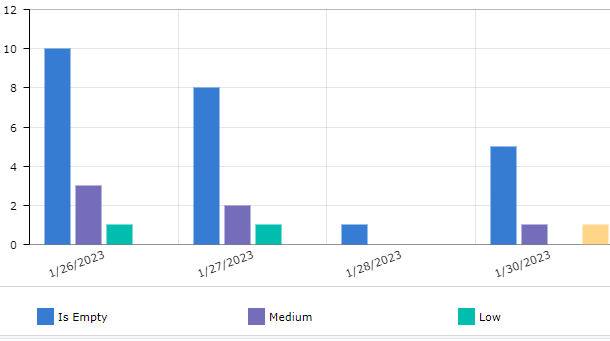
I have a Bar Chart that looks like this:

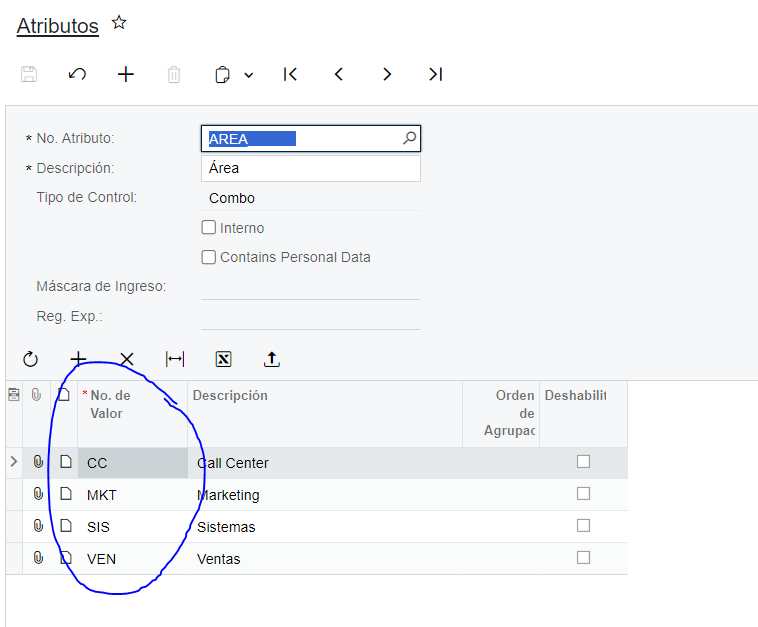
The values are based on a Attribute filed on the Stock Items.  Values are Medium, Low and High.

In the Color option of the Series, I have the following formula based on the documentation.

=Switch(Value = 'High', '#AB400C', Value = 'Medium', '#e9e00', Value = 'Low', '#a9d360')

But the results are this:
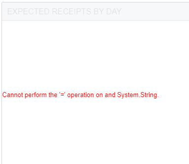
Any ideas?

icon

Best answer by miguel80 5 November 2023, 21:12

View original

4 replies

Userlevel 5
Badge +1

I’m guessing that you’re using the description of the Attribute and not the value. Is it a combo?


If it is, then you should tru to use the Value. Hope this works.

Userlevel 3
Badge

When you say use the Value, and my attribute is set up like the following:


ValueId = 1, Description  = Low


I should change my Switch statement to be:

=Switch(Value = '1', '#AB400C', Value = ‘2', '#e9e00', Value = '3', '#a9d360')


That did not work either.

Userlevel 3
Badge

And my Attributes are set as Combo

Userlevel 3
Badge

After stepping away for a couple of days, I figured out I needed to use “Display Value” as that was how my GI was built to reference the attribute.


Thanks for the help.  Once I allowed my mind to clear, it made sense.

Reply


About Acumatica ERP system
Acumatica Cloud ERP provides the best business management solution for transforming your company to thrive in the new digital economy. Built on a future-proof platform with open architecture for rapid integrations, scalability, and ease of use, Acumatica delivers unparalleled value to small and midmarket organizations. Connected Business. Delivered.
© 2008 — 2024  Acumatica, Inc. All rights reserved