I am trying to build a line graph widget to show opportunities by month year over year:

  • Lines by year (2022, 2023)
  • x-axis of each month - Jan, Feb, Mar, etc. 
  • y-axis quantity of opportunities 

I can’t get it to show generic months and have all years on the 12 months vs actual month 1-2022, 2-2022, etc.

Please let me know if you have a solution.

Thanks!  

Hello,

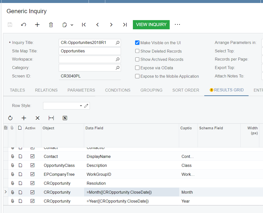
I think in your underlying inquiry you’ll need to add two calculated columns. 

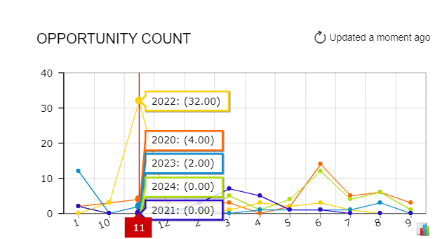
One where you use either the Month or MonthName formula to get the month.  If you want the months to be in order, you might need to mess around a bit with this, as I was getting 1, 10, 11, 12, 2, 3, etc. on my chart or April, August, December, Feb, etc. in Alphabetical order)

  • i.e. =Month(oCROpportunity.CloseDate]) 

And another column where you are just splicing out the year

  • i.e. =Year(=CROpportunity.CloseDate])


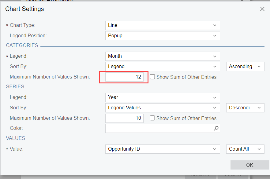
Then you should be able to put the items into your widget (make sure to put 12 as the total values for the Month so you get all of them).

And you should get a chart something like this:


Reply