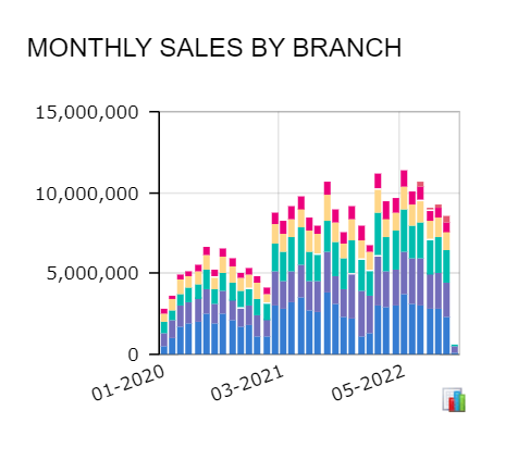
We have noticed a dashboard display difference between versions. In 21 R1, the horizontal labels consolidate for a more clean look while in 22 R2, the labels run over each other. Does anyone know of a way or a new setting to get the cleaner look back?
2021 R1:

2022 R2:


