Question

Monthly cumulative line or bar chart for non financial/GL information

  • 18 October 2023
  • 6 replies
  • 100 views

Userlevel 3
Badge

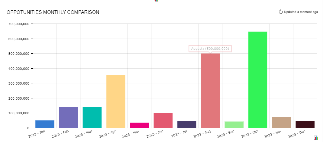
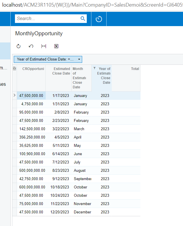
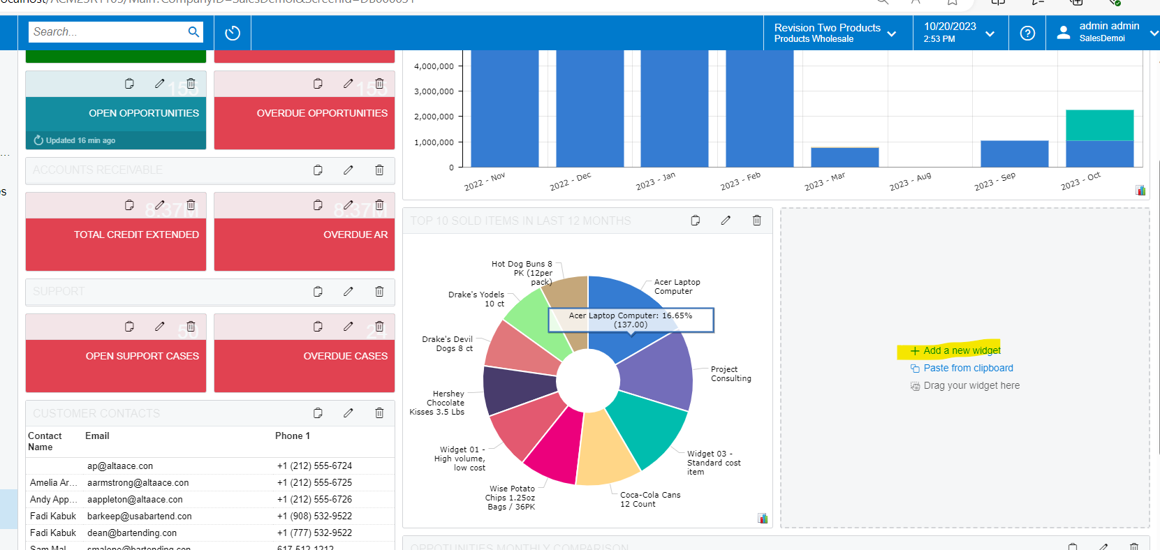
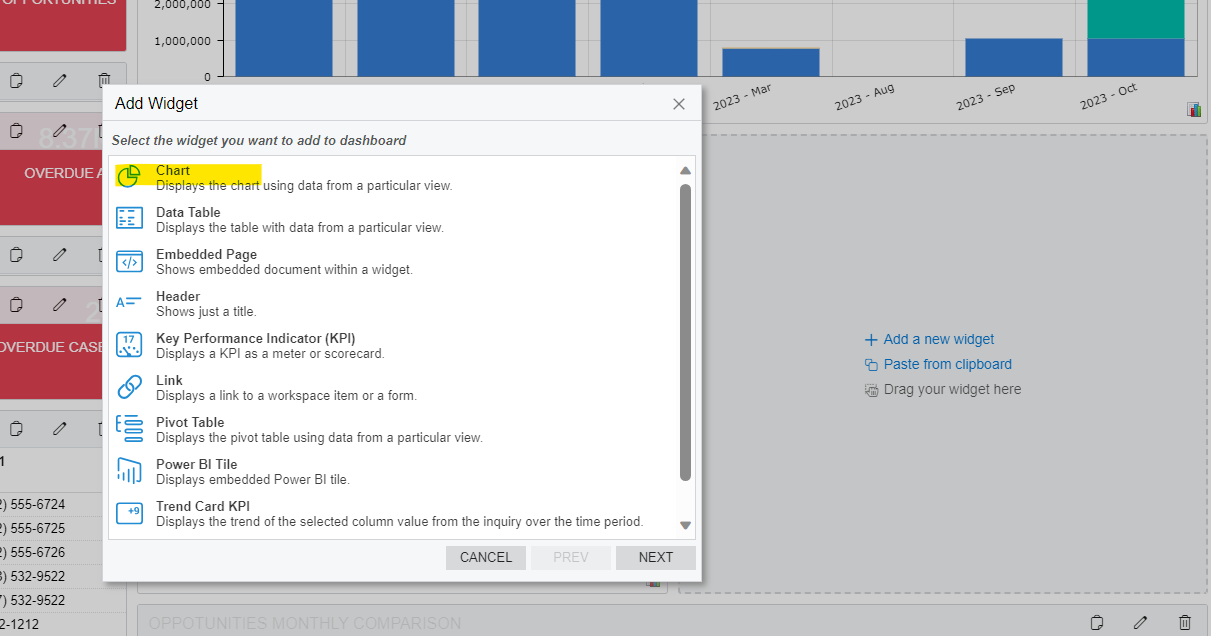
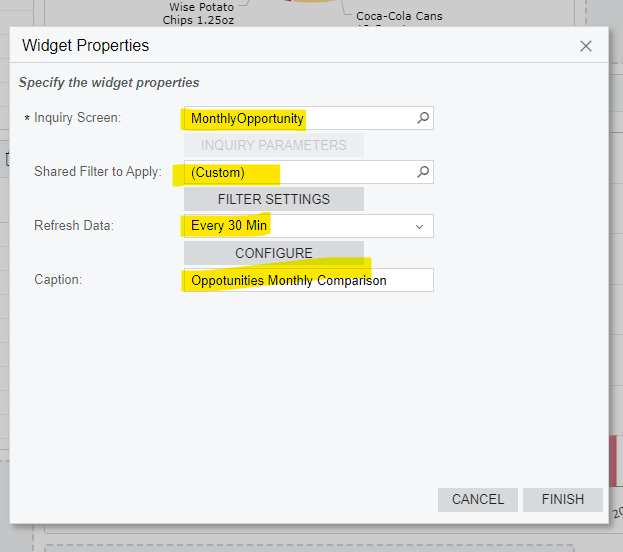
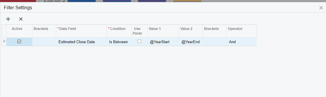
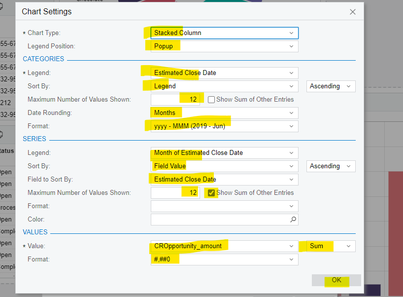
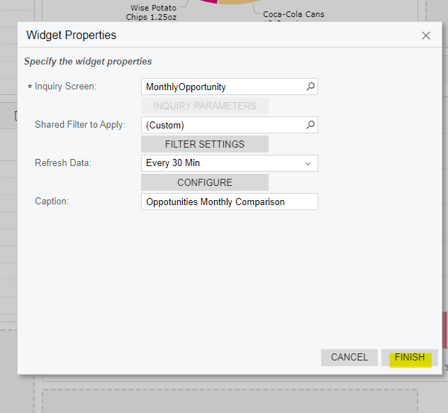
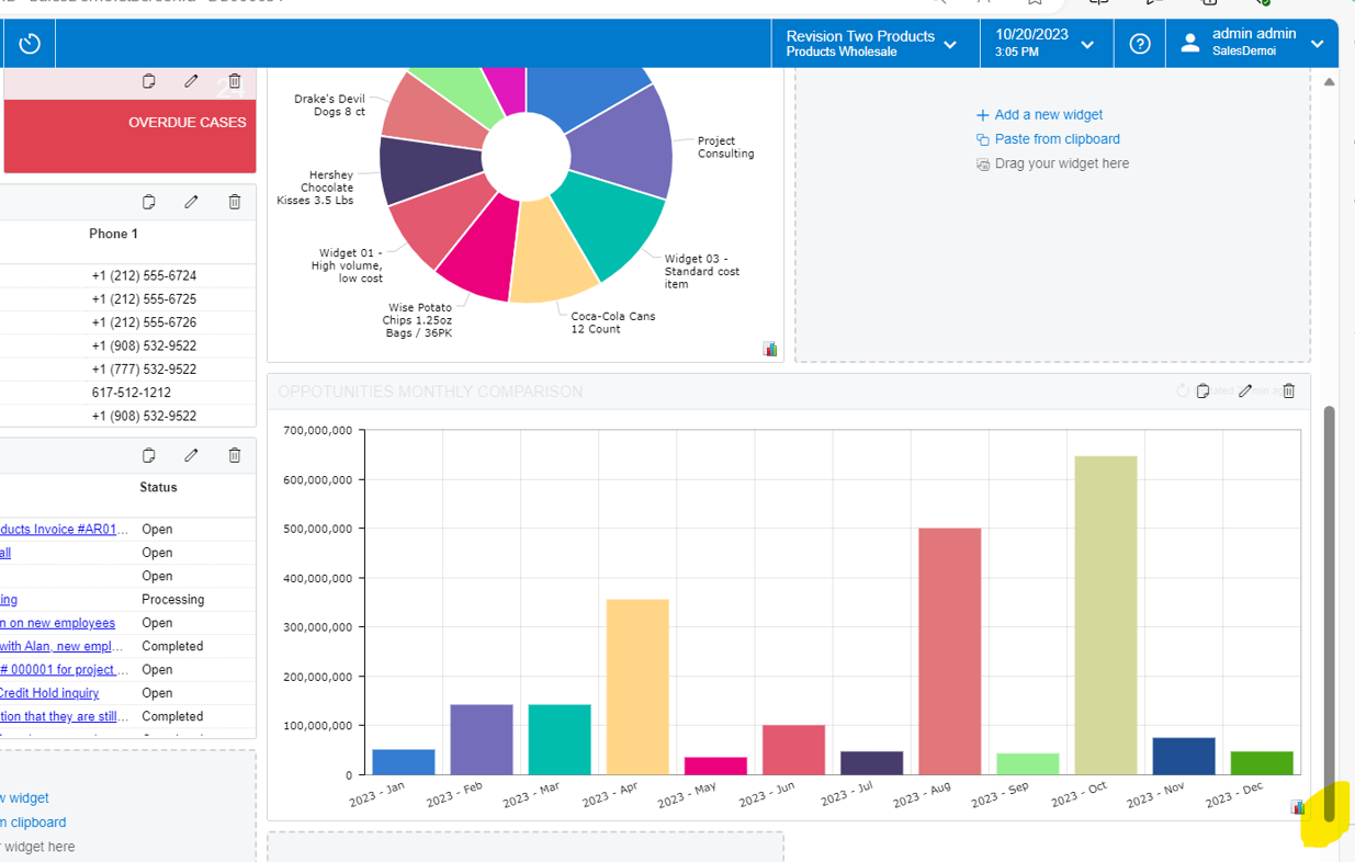
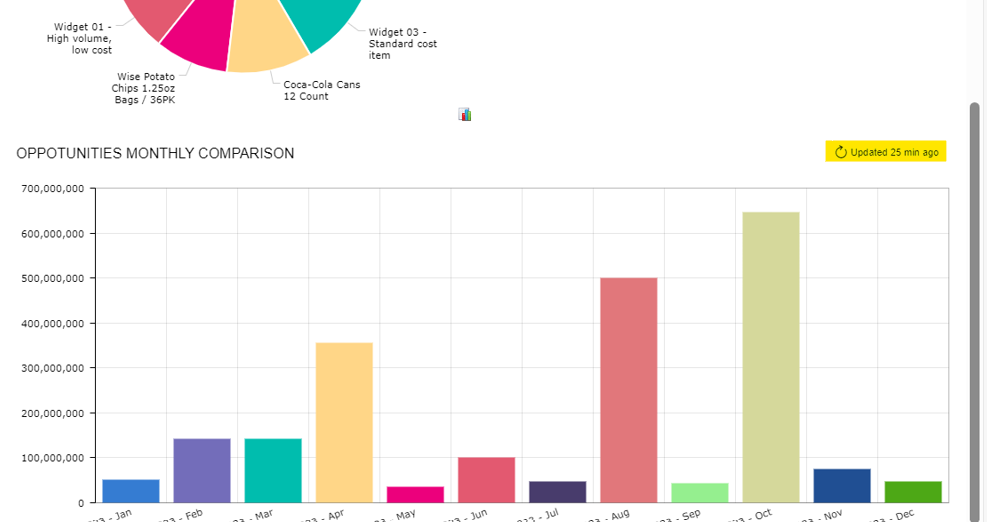
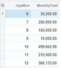
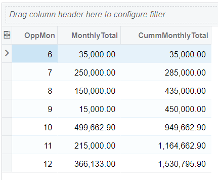
Use-case: Plot using a line or bar chart widget on a dashboard the monthly cumulative total amounts for won opportunities (Acumatica CRM), e.g Jan through Dec, 2023.  Anyone have an example GI configuration illustrating how to do this?


6 replies

Userlevel 7
Badge +9

Hi @john55 A generic inquiry should be prepared for the won opportunities. The generic Inquiry should be grouped by the column that has the formula Month(Date). This will provide the Won opportunities by Month. Using this GI, you can build the Dashboard widget of Bar/ line graph.


Userlevel 3
Badge

Thanks @ChandraM, that gets me the monthly totals, but how do I plot them on a chart cumulatively.  By cumulatively, I mean the Jan bar on the chart = Jan total, the Feb bar = Jan + Feb totals, the Mar bar = Jan + Feb + Mar totals, and so on.

Userlevel 7
Badge +9

Hi @john55 Please find the below steps to create the Column chart.

Result of the Dashboard:


Step 1: Generic Inquiry. Please see attached generic Inquiry with the details of opportunities.

Output of the Generic Inquiry -  for 2023 year by Month:


Step 2 : Dashboard Configuration:

  1.  
  2. Navigate to the specific Dashboard view (in my example, I have added the dashbaord to the Customer View)
  3. Click on Design. This makes the dashboard on design view that allows you to Add new widgets(DashBoard element)
  1. Select the Chart for the bar chart  requirement

v.Confgure Chart as below. Note: You can change the values and verify with any of the options after reviewing this example of chart.

  1. Adding Custom filter - I added @yearStart and @yearEnd to show the current year data. You can adjust this filter to show the date range of the required data.
    1. Configure the graph(chart) - Click on Configure option in the above screen.
      Note: Please enter the values as shown below, atleast for the first review.
    2. Click OK in the above screen and click Finish on the main popup, as shown below. This will show you the preview of the dashbaord.

      ix. Adjust the size of the dashboard by dragging on the right bottom corner(if required)
      1. Exit from the design view by clicking on the “Design menu”, as shown below.
      2. Tip: you can manually refresh data to see the new data quickly by clicking on the below option. Note: This option will be shown when the mouse cursor is hovered on the graph.

         
Userlevel 7
Badge +9

Hi @john55 Please review the above solution and kindly provide your feedback.

Thanks!

Userlevel 3
Badge

@ChandraM Thank you for you attention on this question, I really appreciate it!

The solution you describe still isn’t cumulative.  If it were cumulative, the 2023-Jan amount would be 52,250,000 (as it currently is), 2023-Feb would be 194,750,000 (52,250,000 + 142,500,000), 2023-Mar would be 337,250,000 (52,250,000 + 142,500,000 + 142,500,000), and so on.

Userlevel 7
Badge

Hi @john55 were you able to find a solution? Thank you!

Reply


About Acumatica ERP system
Acumatica Cloud ERP provides the best business management solution for transforming your company to thrive in the new digital economy. Built on a future-proof platform with open architecture for rapid integrations, scalability, and ease of use, Acumatica delivers unparalleled value to small and midmarket organizations. Connected Business. Delivered.
© 2008 — 2024  Acumatica, Inc. All rights reserved