Solved

Donut widget colors don't align

  • 28 August 2023
  • 4 replies
  • 53 views

I created 4 donut widgets showing sales mix between locations.  However, some locations dont have all the types of sales that other locations do so the colors don’t align between the widgets.  How do I have each donut widget show all the sales types so that the colors align?  


Thank you!! 

Hi @srengdahl 

Can you share a screenshot of what you are seeing?


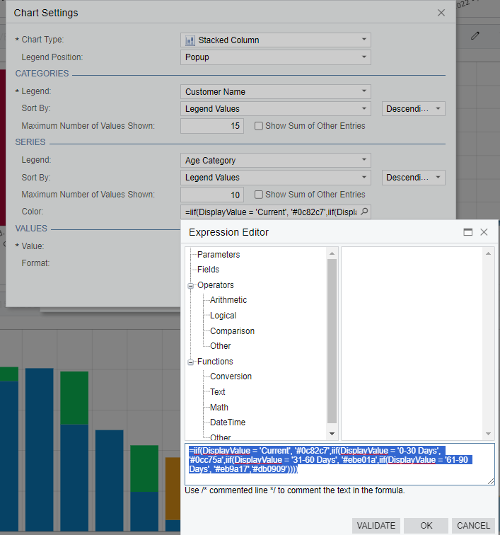
If you want specific things to always be a certain colour, you can hardcode the colour into the chart configuration.  Under the “color” option you can enter it as a bunch of nested iif statements.

Here’s an example I have that groups AR Aging and assigns specific colours to different ages.  You have to know the colour codes ahead of time so that you get the colours you want to see.  You can see a bit of this report behind so the Blue colour is the “Current”, the Green is 0-30, Yellow is 31-60, Orange is 61-90 and Red is 91+.


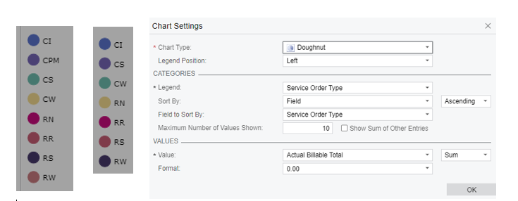
On the doughnut chart type there isn’t the color option to type the formula into.  

The 2 below are pie chart legends showing service order type.  One location has more types of transactions that have occurred for the period of time than the other location.  Since the color scheme starts on the top alphabetically the CPM type in location 1 is the same color as CS in location 2 (location 2 didn't have a CPM type).  I want them to match regardless of whether transactions exist or not so they are comparable by color. 


You’re right… there is no option to put in colors for either the Donut or Funnel style charts.  Might be worth putting this in as an idea?

In the inquiry that you’re pulling your data from, would it be possible to add a join to add the Service Order type and sum them up so you’d have a record of CPM = 0 for your second chart so that both would have all the types?


Reply