Hi everyone,
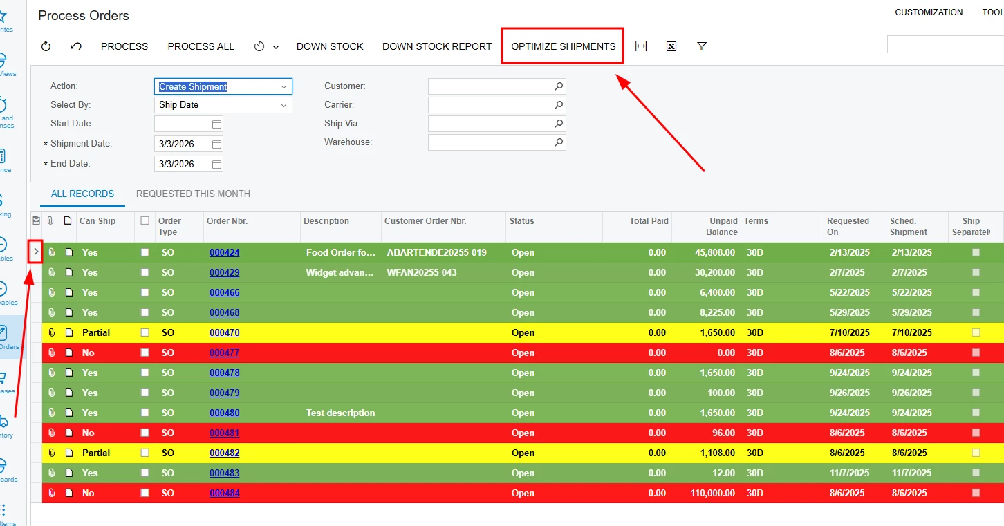
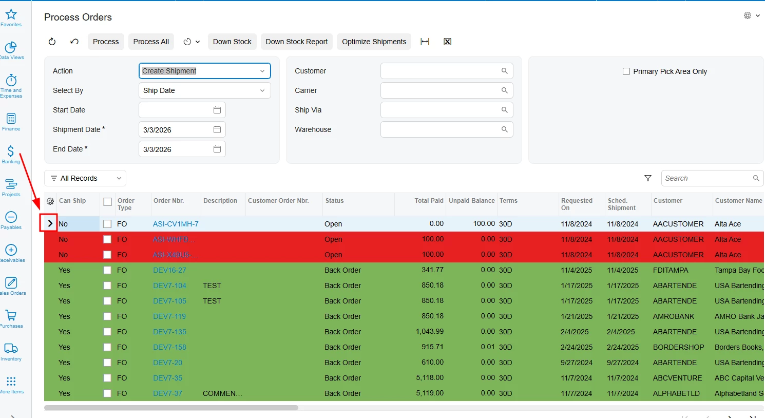
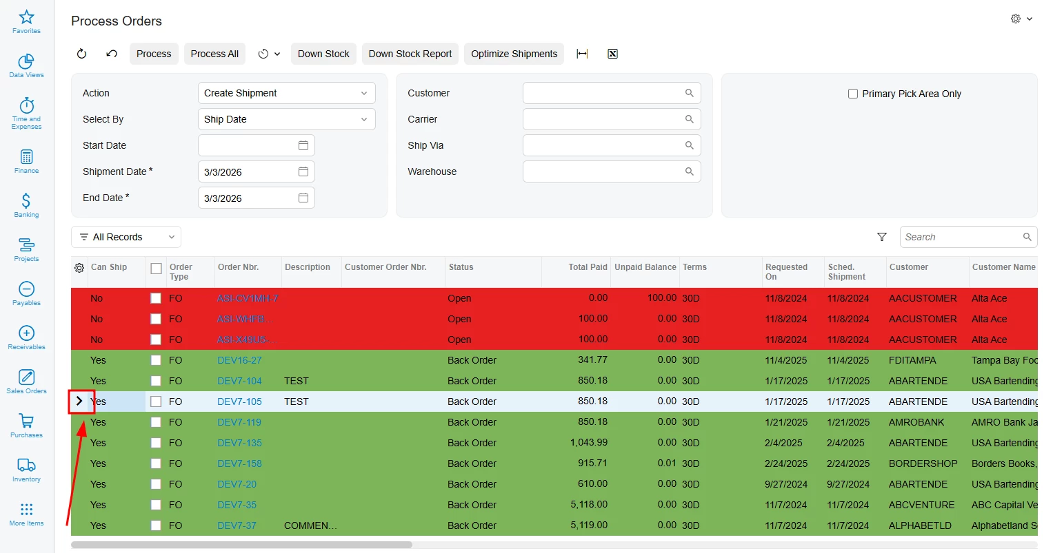
I am implementing custom row highlighting in Acumatica 25R2 Modern UI for the Process Orders (SO501000) screen. I am using CustomEventType.GetRowCss to apply different background colors based on a custom field UsrFRCanShip (Red for No, Green for Yes, Yellow for Partial).
The issue: While the colors apply correctly to most rows, the currently selected or focused row (the one with the > indicator) loses the custom color and shows the default light-blue selection style of the Modern UI.
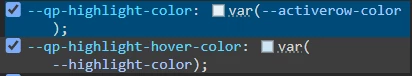
I have tried using !important in my CSS, but the platform's internal selection styles seem to have higher specificity or are applied to a layer that overrides the td background-color during the "Active" or "Selected" state.
TypeScript (SO501000.ts):
@handleEvent(CustomEventType.GetRowCss, { view: "Orders" })
getOrdersRowCss(args: any) {
const row = args?.selector?.row;
this._injectStyles();
if (!row) return '';
const val = row.UsrFRCanShip?.value;
if (val === 'N' || val === 'No') return 'red-cell';
if (val === 'Y' || val === 'Yes') return 'green-cell';
if (val === 'P' || val === 'Partial') return 'yellow-cell';
return '';
}
private _injectStyles() {
if (document.getElementById('custom-row-styles')) return;
const style = document.createElement('style');
style.id = 'custom-row-styles';
style.innerHTML = `
.red-cell td { background-color: #e62121ff !important; color: black !important; }
.green-cell td { background-color: #7EB559 !important; color: black !important; }
.yellow-cell td { background-color: #fafa54ff !important; color: black !important; }
`;
document.head.appendChild(style);
}
What I've observed:
-
In the Classic UI, the selection indicator was an external arrow, and the row kept its color.
-
In the Modern UI, the focused row (the one with the
>symbol) changes its background to a neutral grey/blue, overriding the status color (see attached screenshots).
Question: How can I ensure that custom row styles persist even when the row is selected or has focus? Is there a specific CSS selector or a property within the qp-grid configuration to prevent the default selection style from overriding the GetRowCss results?
Any guidance on the correct CSS selectors for [selected] or [active] states in 25R2 would be greatly appreciated.
